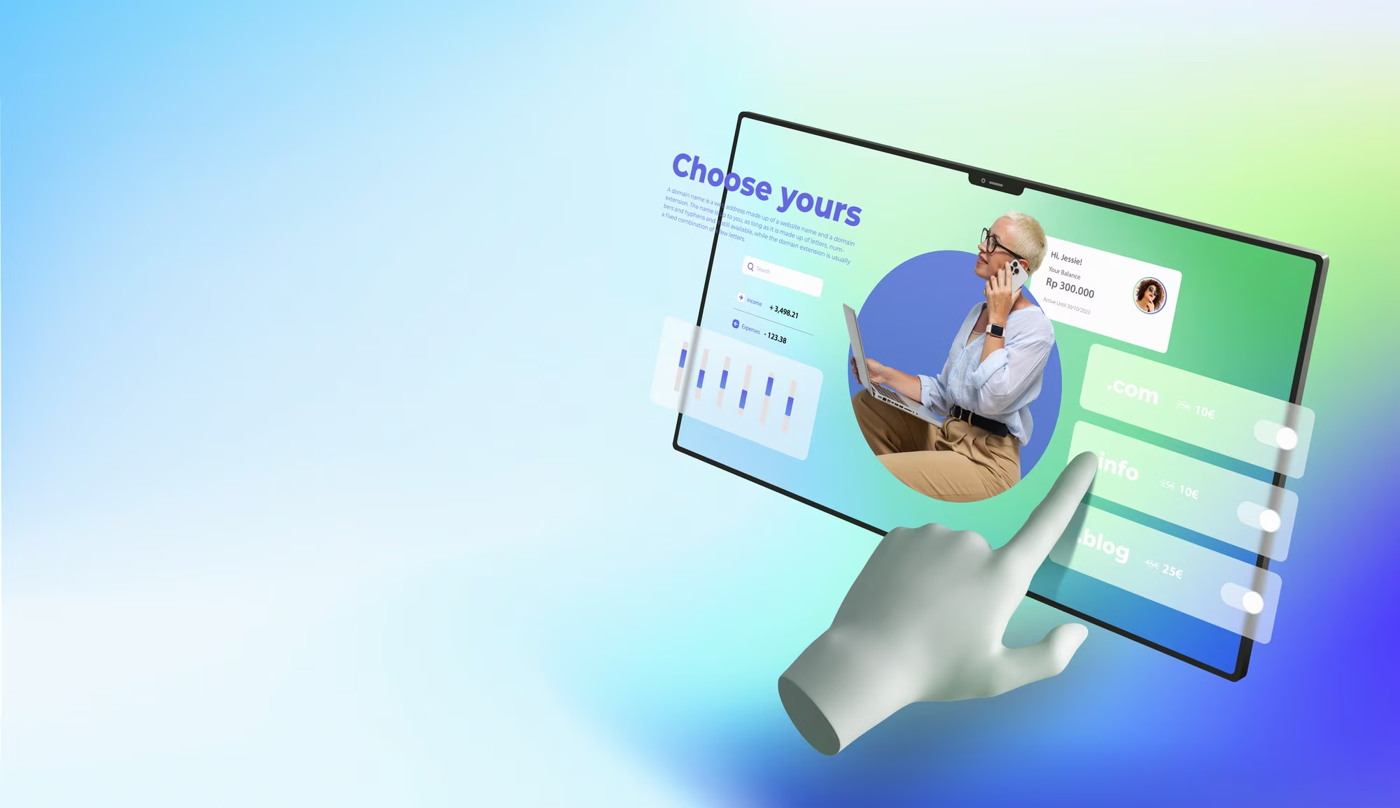
A website can show anything you want it to, but many of the websites that we use day to day are very similar. And there is a reason for this, modern websites are designed to be predictable and easy for users to interact with as soon as they visit. The risk however is that we end up with all sites looking and working the same way, which was a feature of websites made during the 2010s. Over the past few years there has been a shift toward more experimental design trends and ideas, to better reflect the individuality of people and businesses online. Here are some of our favourite design trends of 2024.
1. Experimental Navigation
Most of the websites that many of us use regularly employ a similar tactic when it comes to navigation. A top bar with links to the various key areas of a site, which shrinks to provide a button-based popup or dropdown menu for mobile users. But more and more we are seeing website designers employ experimental navigation tactics with nonlinear and vertical layouts being used to guide users through their site. This can be a great way to make your website standout, just as long as you ensure that your non-traditional menu doesn’t make your site harder to use. Interesting navigation examples: https://kirschberg.co.nz/ https://yourmajesty.co/
2. Text Animations
One way to differentiate your website without drastically overhauling the layout and navigation is to add more granular level animations to prominent text elements. This makes you page stand out and engage the user whilst still adhering to classic website design structures and principles. These animations can also be used to provide additional information in the form of text that changes every few seconds. https://www.twinbru.com/ https://www.darknessintolight.ie/
3. Layering
Minimalism and clean simplistic lines were a strong trend in website design throughout the 2010s and are still widely used, but more and more we are seeing website designers and businesses experiment with layering and overlapping designs. This is seen in the use of offset text and image sections and the use of overlapping shapes and hero elements on pages. This design tactic helps your site stand out and can also be a good way to link image and text on your pages together. https://www.klr-interieur.com/
4. Nostalgia
Another way to move away from the minimalist look of modern websites is to lean into a more retro aesthetic. This trend uses less clean lines and white space and instead uses classic fonts and visual references to print and copy styles of the 70s,80s,90s and early 2000s. This is obviously a very specific look and feel for a website and won’t be appropriate for all business types, but it leans into a more playful and less wooden design for the website whilst still maintaining classic layout elements. It stands out from the crowd and depending on your user base could be a good way to draw people in, something that nostalgia does very well. https://www.typewolf.com/ https://www.weluvvideo.org/
5. Illustrations & Animations
Alongside those nostalgic elements we are also seeing a shift towards hand drawn style illustration and animation styles on websites. This allows for a more organic feel on a website and can be used in conjunction with a more traditional website design to make it pop. At Sprint Digital we employ this kind of design on our website using hand drawn animation styles and icons to provide some personality and show the kind of business we are: one that is serious about key design principles but not afraid to add that little bit extra to elevate our work.
6. Motion Effects
A nice way to implement animations or graphic elements on your page is by using scrolling to trigger them. This means that the user will have a fairy standard web design to look at when they first land on your page, but will also get some interesting animated sections as they scroll down the page. This is part of a wider move toward user interactivity in website design that has really taken off over the past few years. https://design-direction-002.webflow.io/ https://kalso.vaangroup.com/ Website design trends should always be taken with a pinch of salt. You don’t want to go all in on a niche design only to have it look dated in a couple of years’ time, or worse have the design compromise the central function of your site. But design trends come about in response to what website users want to see and the best ways to build site traffic, so it is always worth taking kernels of ideas where you can. If you are looking to build or rebuild a modern highly functional website that will represent your business to its fullest extent, don’t hesitate to get in touch with us at Sprint Digital for a consultation.
Author Bio
Katie McGarr is one of the resident writers for SPRINT DIGITAL Agency Dublin, a firm offering an extensive range of digital marketing and website services to businesses across UK, Ireland, and Continental Europe. She enjoys sharing her insights about blogging, web design, SEO, and other forms of digital marketing.


