

An executive dashboard functions like a strategic radar, helping leaders spot trends and keeps track of your company’s financial health. Perfect dashboards are those where complex data is transformed into a way for users to grasp the information easily. Dashboards lose value if they are unable to show data that has meaningful insights. What’s the point of all those visuals if they don’t help you understand trends, make decisions, or drive action? Organizations that use dashboards to track KPIs are more likely to generate actionable insights.
For anyone looking to make strategic, data-informed decisions and outpace the competition, investing in dashboard development is crucial. According to the source from Gartner, the companies that utilize data visualization tools like dashboards can reduce decision-making time by up to 25%.
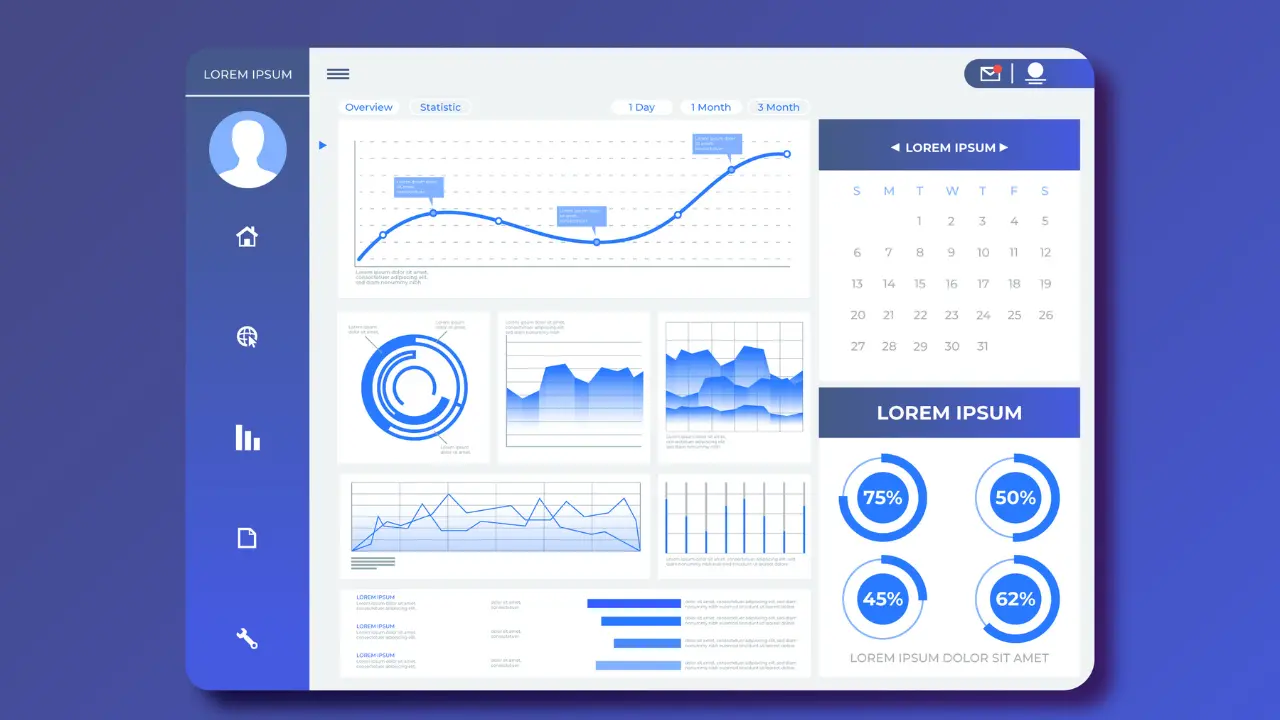
Want to unlock your business potential? You need to consider investing in the perfect dashboard.
Why a Good Design Matters in Dashboards:
The relevance of a well-designed dashboard provides clarity and lets you make quick decisions. And dashboard designs are becoming increasingly popular and act like a perfect map. An intuitive dashboard will help in navigating where you exactly want to go. Let’s take a closer look at why a well-designed dashboard is worth:
- Complex data is swiftly converted and simplified into easy-to-read visuals
- With tools like Google Data Studio and Looker you get the real time insights
- Platforms like Qlik Sense and Domo show appealing visuals and enhances user experience
- Improved collaboration and teamwork with Microsoft Power BI and Tableau Online
- Sisense and Klipfolio offering customization options that suits your business needs
- Detect potential risks with advanced analytics platforms like IBM Watson Analytics
For instance, for a sales team, a well-designed dashboard with appealing bar charts and line graphs helps with quick identification and to track metrics like monthly sales, conversion rates, and customer acquisition costs.
Design layouts that highlight essential metrics for easy access. Key considerations:
- For users to get access quickly, arrange the essential metrics right at the top or in a dedicated section.
- Using white space to get rid of clutter. The dashboard is easy to scan and understand.
- Provide a grid structure to organize content consistently. This helps in the overall flow, enhancing user comprehension.
The Core Element: Dashboard Development Lifecycle
A successful dashboard relies on a robust development lifecycle, and this is why it should not be overlooked. It’s essential that users must be involved from the beginning of the process. And throughout the development process the testing phases help in detecting issues before launch ensuring that the dashboard remains functional.
By applying the right techniques in the Dashboard Development Lifecycle, your dashboard can truly stand out. Let’s see below what those are.
- Through surveys, interviews, and workshops you can collect user requirements and define the objectives.
- Through prototyping you can give stakeholders a sneak peek of how the dashboard is going to look like. This is a good way to visualize the design before its built.
- Utilizing agile techniques enables iterative development, where teams can quickly adapt based on user feedback and changing needs.
- Tools like ETL (Extract, Transform, Load) for data integration.
- Before the dashboard goes live, identify the pain points and conduct usability tests
- Performance monitoring through analytics and user feedback collection for tracking dashboard usage.
- Regular reviews and updates based on user feedback? This keeps your dashboard fresh
Choosing the Right Dashboard Development Tools
Tableau and Power BI are some fantastic tools that have amazing visualization features. Yet they are chargeable. But Google Data Studio is great if you are looking for a free option. Each tool offers unique functionalities to help turn data into meaningful insights.
The latest features in Power BI being Smart Narratives, this has made dashboards more informative by using NLP which automatically generates insights and explanations for your data visualizations. Moreover, Power BI continues to enhance its integration capabilities with tools like Azure Synapse Analytics, allowing for improved data processing and analytics
Things that you need to look at when you are selecting the right tool, these are-
- Budget is the first main factor where there are free options available but for some, you need to pay.
- Integration with existing systems, user-friendliness, and customization options should be considered. These will definitely ensure seamless connectivity with your current data sources, which is what you have been looking for.
In conclusion, as you are reading this you probably would have understood the relevance of dashboard development for your data visualization and analytics, Dashboard Experts India has got you covered. With their dashboard development services and specialized sales dashboard services, we can help you transform your data into actionable insights. So, why wait? Check out our website to find exactly what you need!